
|
|
|
|
|
|
|
|
|
|
|
|
|
|
|
|
|
|
|
|
|
|
|
|
|
THETA AG
|
|
|
Tel. +41 44 217 80 14
|
|
|
|
|
|
|
|
|
|
|
|
|
|
|
|
|
|
|
|
|
|
|
|
|
|
|
|
|
|
Return
|
|
Single Asset View: MSCI World
|
|
|
Index Family: [dynAAx World]
|
|
|
|
|
|
|
|
|
|
|
|
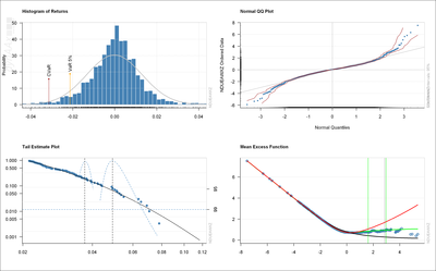
How to read this graph
|
The financial returns are the measure of gains and losses within a given time period. They show up several stylized facts which differ sifnificantly from a normal distributed behavior. The display of returns in histograms, in quantile-quantile, tail estimate, and mean excess plots allow to make this behaviour transparent and measurable. As more as our results for the empiral data deviate from the normal begaviour, as more we consider the generating process of financial returns to be risky.
The histogram displays tabulated returns from constant bins or intervals as bars. Thus a histogram gives an estimate of the density of the returns. For the extreme returns we can estimate the value at risk (VaR) and the related exptected shortfall risk, also called Conditional Value at Risk (CVaR). The 95% significance levels for bother measures, VaR and CVaR, are marked in the tail of the histogram plot by vertical lines. The normal distribution line which is added as a fit shows us the deviation of the empirical values from the normal behavior.
The quantile-quantile plot is a graphical method for comparing two probability distributions, by plotting their quantiles against each other. Here we use the quantile-quantile plot to compare the empirical distribution of financial log returns (on the y-axes) with the expected theoretical one (on the x-axes). If the empirical drawdowns match the normal ditribution, the points will be on a straight line. Points of the empirical drawdowns which fall on the loss side below the straight line are assumed to be more risky than be expected for the from the normal distribution.
The tail estimate plot shows how the estimate of a high quantile in the tail of the financial returns based on the GPD approximation varies with threshold or number of extremes.
The mean excess plot displays sample mean excesses over increasing (loss) thresholds. An upward trend in the plot shows heavy-tailed behaviour. In particular, a straight line with positive gradient above some threshold is a sign of a Pareto behaviour in tail. A downward trend shows thin-tailed behaviour whereas a line with zero gradient shows an exponential tail. As more as the line of the mean excess bends up as more risky the asset can be considered.
|
|
|
|
|
|
|
|
|
|
|
|
|
|